How To Create Transparent Text Effect on an Image – Photoshop Tutorial
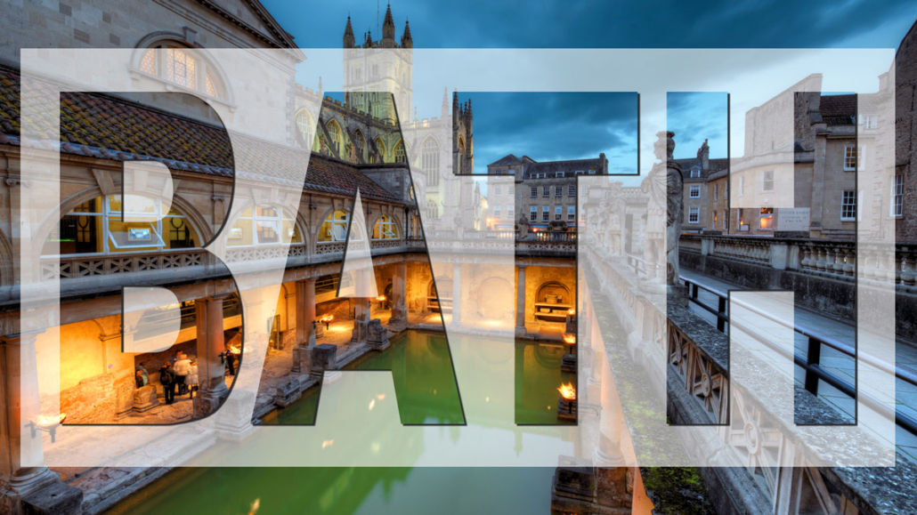
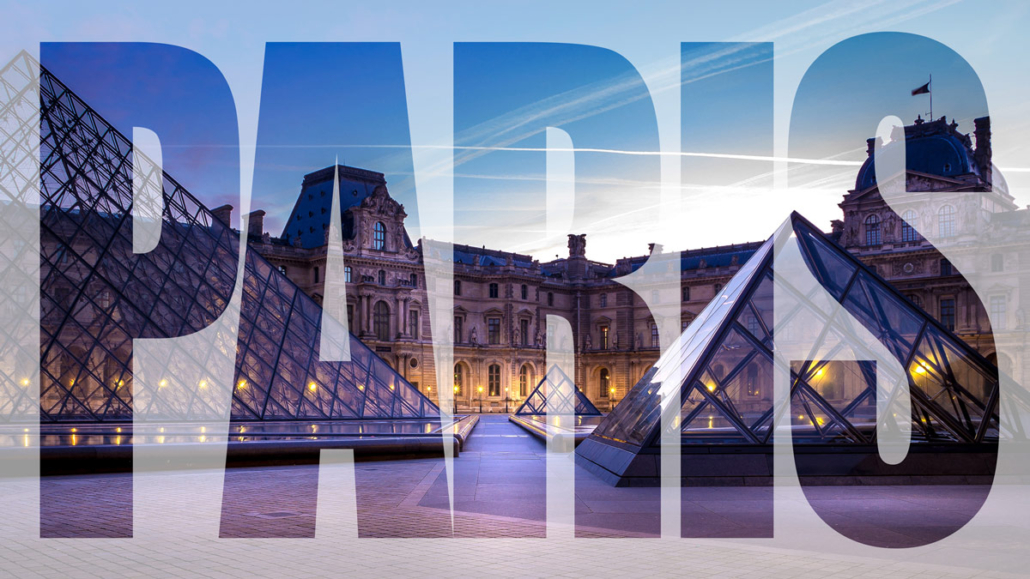
In this blogpost and video, I will show you how to do a text effect over an image, like on the pictures below.


I have created a video tutorial to show you about placing transparent text on an image in Photoshop.
When we place text on an image, and the text is difficult to read, readers may get forced to choose between straining their eyes and skipping over the content.
Rather than risking that users ignore your text, you can implement small changes to the design to increase the contrast between the text and the background.
So let me show you how to do this in photoshop in the video below:
If you prefer to read rather instead of watching the video, here are the different steps to take to create this transparent effect.
- In Photoshop, we start by opening a new project, Select and add a background picture Or we start by opening an existing picture (here I will use an HDR picture)
- Next, New layer, Fill that layer with white, Set the transparency to around 60-70
- Next step is to add the text we want to put on top of the image, I select the text too and start typing your message, the text that goes on the picture.
- We color the text black, and put in central in the frame with Ctrl-A, selecting align vertical and horizontal to the center, Ctrl-D to deselect
- Next step is to group the text layer with the white layer, we cam hit Ctrl-G or Cmd G on a mac, or use the menu Layer, group layers
- In the group we select the text layer and open the blending options by right-clicking. We are going to knockout the text by selecting shallow and we set the fill opacity to our liking, around 25-50%
The get more readablitity of the text and still remain a good view of the picture there are several options
- Blur out the background a bit (with directional blur)
- Make the white rectangle layer smaller so you can still see the image clearly, and read the text at the same time
- Add a drop shadow to the text
Always pay attention, when you overlay text on an image, because you are sacrificing two things: Image clarity – Text readability
For example the picture of the parliament in Budapest, placing text on less complex areas of a photo will typically improve the readability, like we did with the picture here. Putting the text on the water, keeps the subject of the image, the building is still visible.
Adding a drop shadow or stroke effect to your text will help increase readability in photos with more complexity.
Try to play around with the text design and see what combination works best for your chosen image.
Good luck!

